Classifying data
Classifying your data into categories and grouping geographic features or data into classes based on a certain criteria can help you better understand your data.
Thematic maps that employ classification schemes
There are several map types that employ classification schemes to represent data. Chorochromatic maps use color to represent data values, with different colors indicating different categories or types. These maps are used for qualitative and nominal data, showing distinct areas without implying any order or hierarchy. On the other hand, choropleth maps use varying shades of color to represent data values, with different shades indicating different ranges or magnitudes. These maps are used for quantitative and ordinal data, providing a clear visual representation of hierarchy or order. This is useful for showing population density, income levels, or other socio-economic related data. You can apply the logic from choropleth maps to proportional symbol maps. Proportional symbol maps use symbols of varying sizes to represent data values, with larger symbols indicating higher values and smaller symbols indicating lower values.
Methods for classifying data
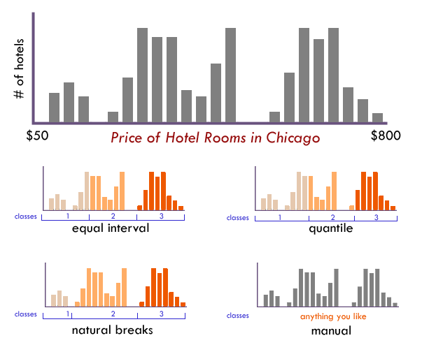
Thematic maps, such as choropleth maps, shade areas in proportion to how data are classified. Class intervals represent the number of classes or groups that data are divided into. As a general rule of thumb, you could aim for 4-6 classes, but it's always best to consult the histogram of your data. Too few classes can oversimplify the data, while too many classes can make the map difficult to read. Data can be classified with any one of the following methods
- Natural breaks (jenks) are based on natural groups by an automated program, minimizing the variance within classes and maximizing the variance between classes
- Quantile observations are equal across the class intervals, but can be misleading due to each class having an equal number of observations, completely ignoring the range of values provided
- Equal interval divides the range of data into equal intervals by the number of specified classes, but can be misleading due to the range of values provided
- Standard deviation classifies data based on the standard deviation of the data values
- Manual classification is entirely up to you and your understanding of the data
Try to classify data
The map allows you to classify US states by population, area, and density. It uses three classification methods: natural breaks, quantile, and equal intervals.
You can adjust class numbers, and color schemes like sequential, diverging, and qualitative.
Sequential schemes are suitable for ordered data, while diverging schemes transition between two contrasting colors for meaningful midpoints. Recall the choropleth map from the types of maps lesson for the sequential and diverging color schemes.
Qualitative schemes rely on contrasting colors without implying order, making them ideal for categorical data.
Understanding the distribution of the data is crucial for classification, but without a histogram, it can be challenging to determine how to best classify the data. Try your best!
Test your knowledge
Is the following statement true or false? Equal intervals mean each group has the same size. Quantiles mean each group has the same number of items.
